Key Graph Shows Housing Boom-Bust
by CalWatchdog Staff | April 22, 2011 10:43 am
John Seiler:
Except for Nevada, California was hardest hit by the boom-bust of the housing market during the previous decade. Most explanations show how prices doubled or even tripled in many places — then crashed back down to earth, in some cases losing up to 70 percent of their value.
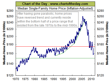
But most graphs use the actual prices people paid for their homes. That doesn’t take into account inflation. The following graph, from ChartoftheDay.com[1], shows the housing boom/bust if the cost-of-living increases of recent years are taken into account. It is for all of the USA.
 [2]
[2]
.
As you can see, it shows that there is an average base price of from $160,000 to $175,000 for homes (in today’s inflated currency). The boom goosed that to near $260,000. Then the bust crashed it back down to the base price.
As Wayne Lusvardi notes in an article today[3], numerous redevelopment and “affordable” housing scams are major culprits in the boom-bust, especially in California. Such programs make liberal do-gooders feel all gushy inside, while making billions for developers who get out before the crash.
But such policies only cause havoc for regular, middle-class folks, who jump on the rocket upward — then have to default on their homes when the market goes bust.
As always, it’s best to just leave the market to sort out prices, with no “help” from government manipulations.
In recent years, we’ve learned that lesson again — the hard way.
April 22, 2011
- ChartoftheDay.com: http://chartoftheday.com
- [Image]: http://www.calwatchdog.com/wp-content/uploads/2011/04/Chart-of-the-day-housing-prices-CPI.gif
- notes in an article today: http://www.calwatchdog.com/2011/04/22/counties-still-ignore-pension-tsunami/
Source URL: https://calwatchdog.com/2011/04/22/key-graph-explains-housing-boom-bust/