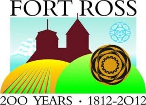
Fort Ross is Now Logoriffic!
Anthony Pignataro:
Fort Ross State Historic Park has a new logo! To commemorate the 200th anniversary of its 1812 founding! And it’s already for sale! “The logo will be in all exhibits and publications related to the programs and projects for 2010 and will also adorn everything from coffee cups to t-shirts, which are now available at the Fort Ross Visitor’s center,” said a Fort Ross press release last week.
Since Fort Ross is a government operation (well, mostly — read this story to learn about its new Russian benefactor), a “steering committee” chose the new logo, which was designed by Mendocino artist Drew Fagan.
Something about the logo struck us as, well, unusual. Look at it yourself:
There’s a lot going on there. You’ve got the fort chapel on a series of hills, with we think the moon behind it and a Native American basket thing in the right corner and a clipper ship coming up on the left towards a farm.
Anyway, to find out if we were just being ultra-critical, we showed the new logo to three graphic designers we know and had them look at it. Their thoughts on it, all made completely independently of each other, showed remarkable similarity…
DANA BEIGEL, Pacific Research Institute graphic artist:
If it is just supposed to be a straight out logo, with dates to show historical longevity, I would say it was too busy. If it is being used for something specific, then it might work.
I’m not sure of the significance of the two circles on the right. The blue and then the yellow and black. There are too many colors going on. It’s good that it is illustrative and not photographic, but there are too many elements to me.
What is the yellow and gold circle about? That alone could be powerful. And the type and the dates look nice. But my two cents would be to simplify
WENDY ORTIZ, former Maui Time Weekly art director:
There’s a lot going on there. It incorporates all aspects of Fort Ross, which is nice, and would probably work on a web page but some of the details get lost, like the mountains on the top left and the native American moon. The basket and the moon have too much detail to be that small. It will be okay on the web because it will probably never be seen very small. It wouldn’t work very well for print.
The font is really nice and I like the colors. It’s always difficult to design a logo when you have a lot of elements to incorporate. For someone who isn’t a graphic designer he did a great job.
ELAINE SCHITEA, International Academy of Design & Technology graphic design student:
It’s too busy. There are too many things going on at the same time. I don’t like the boat in the background — it contradicts the other things in the logo. It’s just too much. The basket thing is okay but the funky moon symbol? Eh. Now the silhouette of the building is good, but I don’t like the boat or the funky moon.
Related Articles
Big Bucks to defeat Prop 23
Katy Grimes: UPDATE: Contributions for Proposition 23 have been updated today, according to MAPlight.org The YES on Prop 23 campaign
Unions' war on accountability
Steven Greenhut: The LA teachers’ union is livid over a Los Angeles Times series and database that enables readers and
The Politician's Whisperer
Katy Grimes: Jerry Brown is known for the “uncanny ability to reinvent himself.” However, Brown’s political record is all over the


